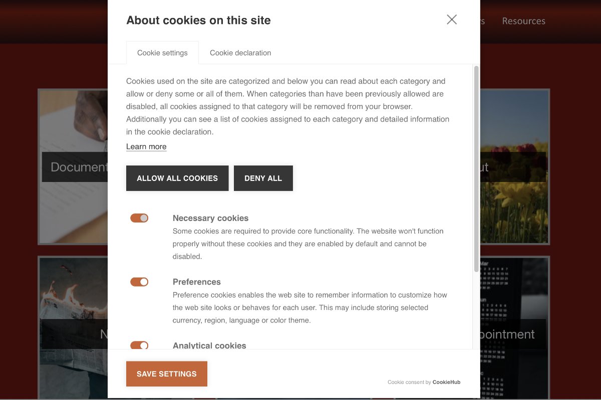
From conducting decades of user research, we know that people dislike popupsand modals. I was reminded of this fact during a recent usability study. While attempting to complete a task, a participant tossed his phone across the table after encountering multiple popups, consecutively. Frustrated, he abandoned his task and left the website with a very bad impression of the organization. Several other users shared a similar sentiment, albeit they did not throw their phones.
A popup(also known as an overlay or popover) is a window or dialog that appears on top of the page content. A popup can be classified according to two dimensions:
1. Whether the user can interact with the rest of the page:
- Modal: the content on the page is disabled until the user explicitly interacts with the overlay.
- Nonmodal: users can still interact with the background content (for example, by selecting links or tapping buttons) while the overlay remains visible.
2. Whether the background is dimmed:
- If the background is dimmed, the popup is called a lightbox.
- There is no special name for the case when the background content is not visually dimmed.
Although in many cases lightboxes are modal, that is not always true.
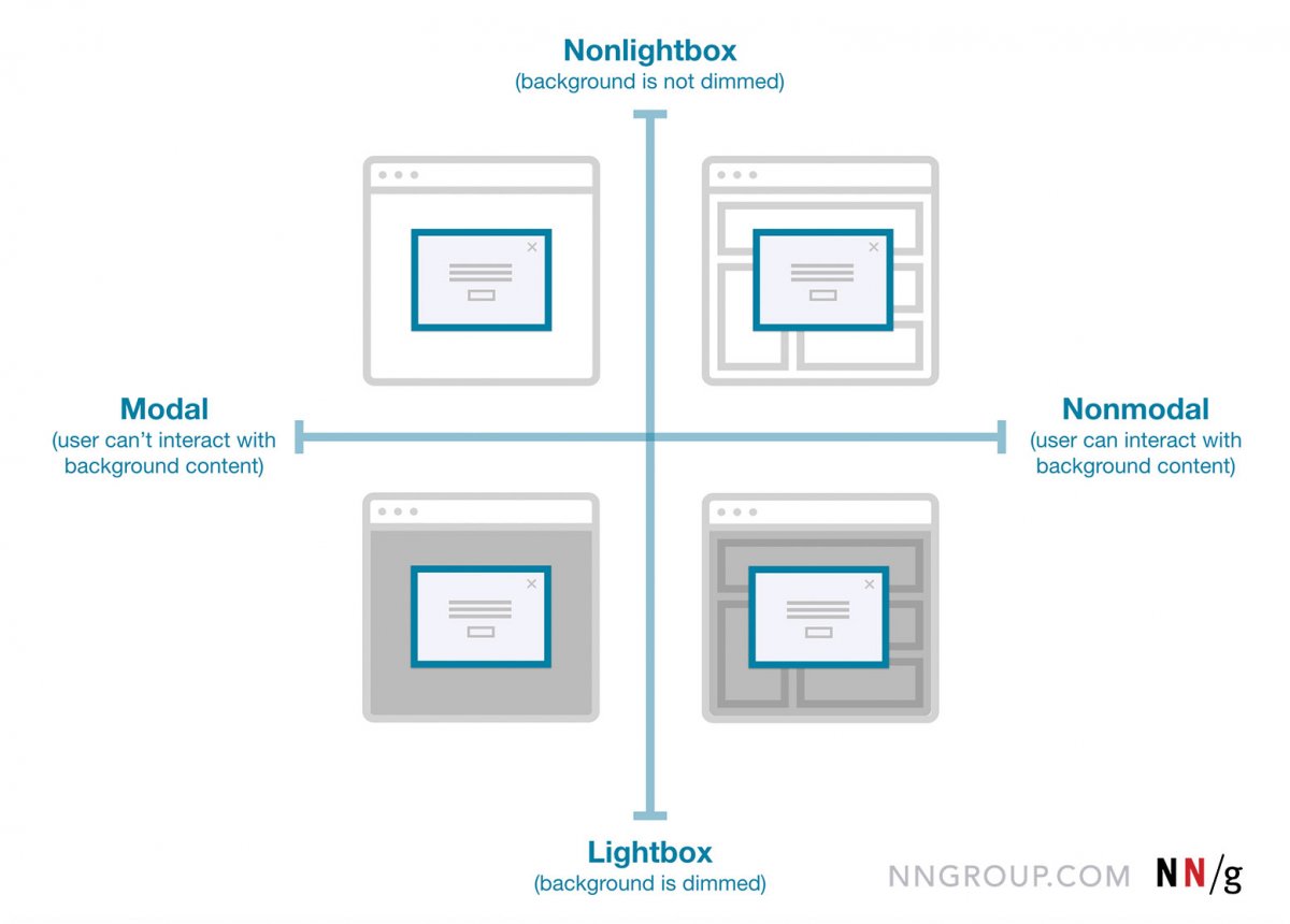 In terms of popup anatomy, modal overlays disable all background content, nonmodal overlays preserve users’ ability to interact with background content, and lightboxes dim the background content.
Over several weeks, I captured screenshots of every popup I encountered on websites and in mobile applications: on average, 25 popups per week, which is more than any human being should have to endure (but is pretty representative of today’s internet user experience). This experiment, together with my usability study, surfaced a myriad of bad implementation practices and was proof that the overuse of overlays is far from over. We’re nearing the point where websites have abused these elements so much that the problematic instances far outweigh the cases where popups remain a useful design tactic. In this article, I’ll outline the issues I observed and discuss key factors to consider, along with realistic alternatives to popups that preserve the organization’s intent and the users’ experience.
Popup Timing: Don’t Prompt Before Interaction or During Critical Tasks
1. Showing a popup before the main page content loads: Regardless of the variation used, never show a popup before users can glean value from your website or application. This trend is highly intrusive because the users’ task is interrupted before they even land on the page. People have grown accustomed to seeing premature popups on websites and usually ignore them or immediately look for the fastest means by which to close the popup to return to their task. Popups that appear before the page loads make the site look desperate and the user experience feel frantic. Additionally, sites who fail to recognize these facts risk low rankings in search-engine results as Google penalizes sites that use practices which make content less accessible to users, especially on mobile.
What to do instead: Wait to present the content in the popup until it’s contextually relevant to the user. Use the reciprocity principle: give value to your visitors before asking them anything — whether it’s requesting an email address, or even the action of dismissing the popup. Run user testing to identify the context appropriate for whatever content you were planning to display in the popup and figure out the best way to display that content; in many cases it will not be in a popup. The only use case when it is acceptable to display any kind of popup before the page content loads is when your site is legally obligated to request consent from users to accept the use of cookies or verify their age.(Though we wish that the EU and other regulatory authorities would embrace a less annoying interpretation of GDPR and similar rules.)
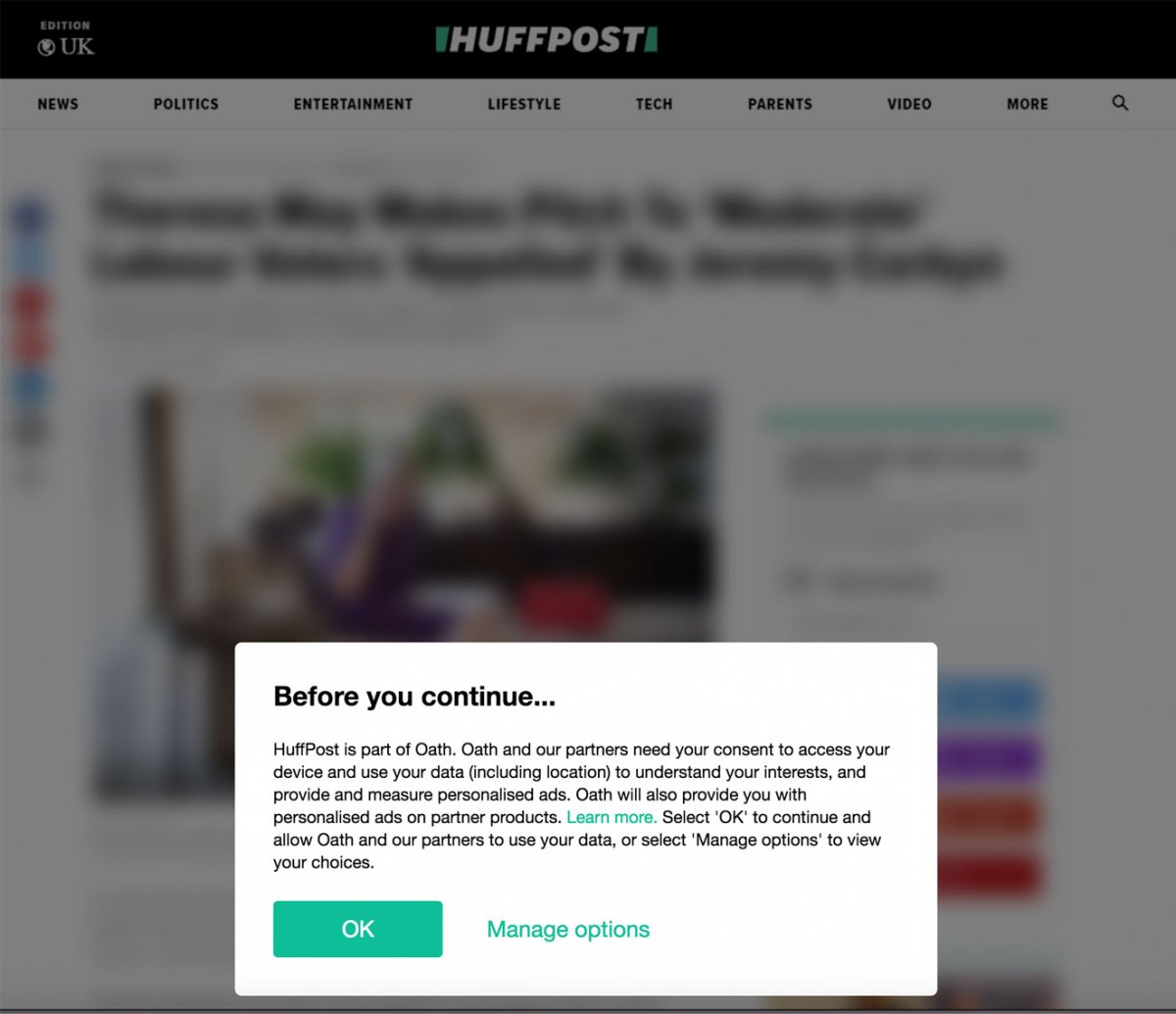
HuffPost presented users with a lightbox before the main page content loaded. This is an acceptable use of an otherwise problematic practice, as the website is legally obliged to ask for consent when using personal data, including location.
2. Displaying a popup right after the user logs in: A popup displayed right after the user logs in is just as bothersome as one shown before the page content loads. When users log in to an account, they have a next step or subsequent task in mind — or else why would they have logged in?! Immediately presenting a popup of any kind will distract and impede them from completing their next step. Because they’re focused on the next step, it’s likely that users will pay no attention to the popup or abruptly close it. Not only that, but they may get frustrated by the interruption and by the extra time and interaction costrequired to close the popup or move it out of the way.
What to do instead: Give users some time and space to complete their tasks after logging into their account and don’t show popups right away. It’s acceptable to eventually present helpful account tips, guidance, or new features after some time has gone by, but only if the user’s task is enhanced or further supported by the content presented or by the new functionality. In these cases, always favor less intrusive methods such as tooltips;and small, nonmodal overlays to communicate about these elements.
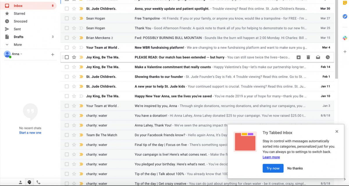
Gmail used a relatively unobtrusive nonmodal overlay to introduce a new feature that supported the user’s current task of cleaning up the inbox. The nonmodal overlay appeared after the user interacted with the inbox, rather than immediately after login.
3. Asking for an email address before interaction: Many sites and applications use popups to ask for the users’ email address before they have even had a chance to interact with the content. Ecommerce, news websites and applications, as well as blogs were the biggest offenders in this category. This approach is problematic because not only will people be annoyed by the popup, its timing, and the fact that the site is asking for email addresses too soon, but they will also assume that the site will spam them with unwanted junk mail.
For example, one user who landed on Uncommon Goods’ website became disgruntled when she was greeted by a modal overlay asking for her email address to get access to secret sales. She said, “It really annoys me when stuff like that pops up before I’ve done anything else on the website. How do I know if I want to be an email subscriber if I just got here? I would prefer to get that a little later on.”
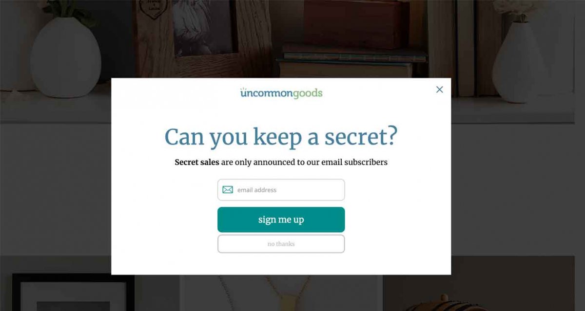
One user became annoyed by Uncommon Goods’ website when it displayed a modal overlay asking for her email address shortly after she arrived on the site.
There are many tradeoffs to consider when asking users for their email address. Sites and applications often use premature modals because of the short-term uptick in metrics they yield. However, short-term metrics often come at the price of frustrating many users who are not motivated by arbitrary incentives, such as secret sales.
What to do instead: Rather than showing email popups early on, think of when users might be most comfortable sharing their email addresses with you. Are they browsing a category which has an applicable promotional code? Or maybe they’ve just read (or scanned) an entire blog post. These actions could be appropriate triggers for a minimally intrusive nonmodal overlay, which could appear close to the upper or lower right corner, and use a sensible amount of screen space. Offer users something valuable and tangible in exchange for their email address; don’t just expect them to hand it over.
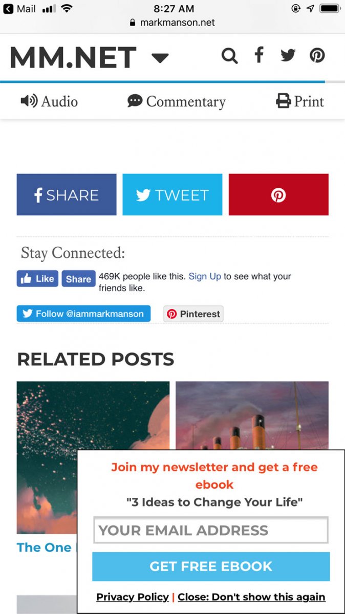
MarkManson.net displayed a minimally intrusive nonmodal overlay after people had reached the bottom of a blog post. The popup also offered a free ebook as an incentive.
4. Asking for feedback before people have done anything meaningful: Receiving feedback from your users is important, but you shouldn’t flood people with feedback prompts before they have done anything on your site. Sites and applications tend to present users with feedback popups right away in hopes that they’ll give a high rating and move on with their tasks. Rarely does this happen; more often, users swiftly close the popup, with no intent to seek it out again.
Getting meaningful feedback from your users at appropriate points in the experience provides insight into their challenges and roadblocks. But if you ask for feedback too soon, you risk not getting any when it matters most. For example, while trying to pay a phone bill on ATT.com, a study participant became frustrated by a feedback modal that had appeared right as she landed on her bill. She said, “Well, I would have given feedback after I paid my bill, but now I’m frustrated that this is here and I haven’t even done anything yet to give feedback on.”
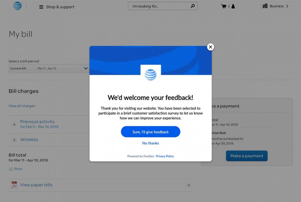
A study participant begrudgingly closed a feedback modal while trying to pay her phone bill. She stated that she hadn’t done anything on the site yet to warrant giving feedback.
What to do instead: Ask users to provide feedback immediately after they have completed a top task on your site. This approach minimizes interruptions and ensures that the feedback will be based on an actual interaction. For example, the video-conferencing software BlueJeans asked users for feedback after a meeting concluded. This request did not display prematurely, but at a contextually relevant and appropriate time.
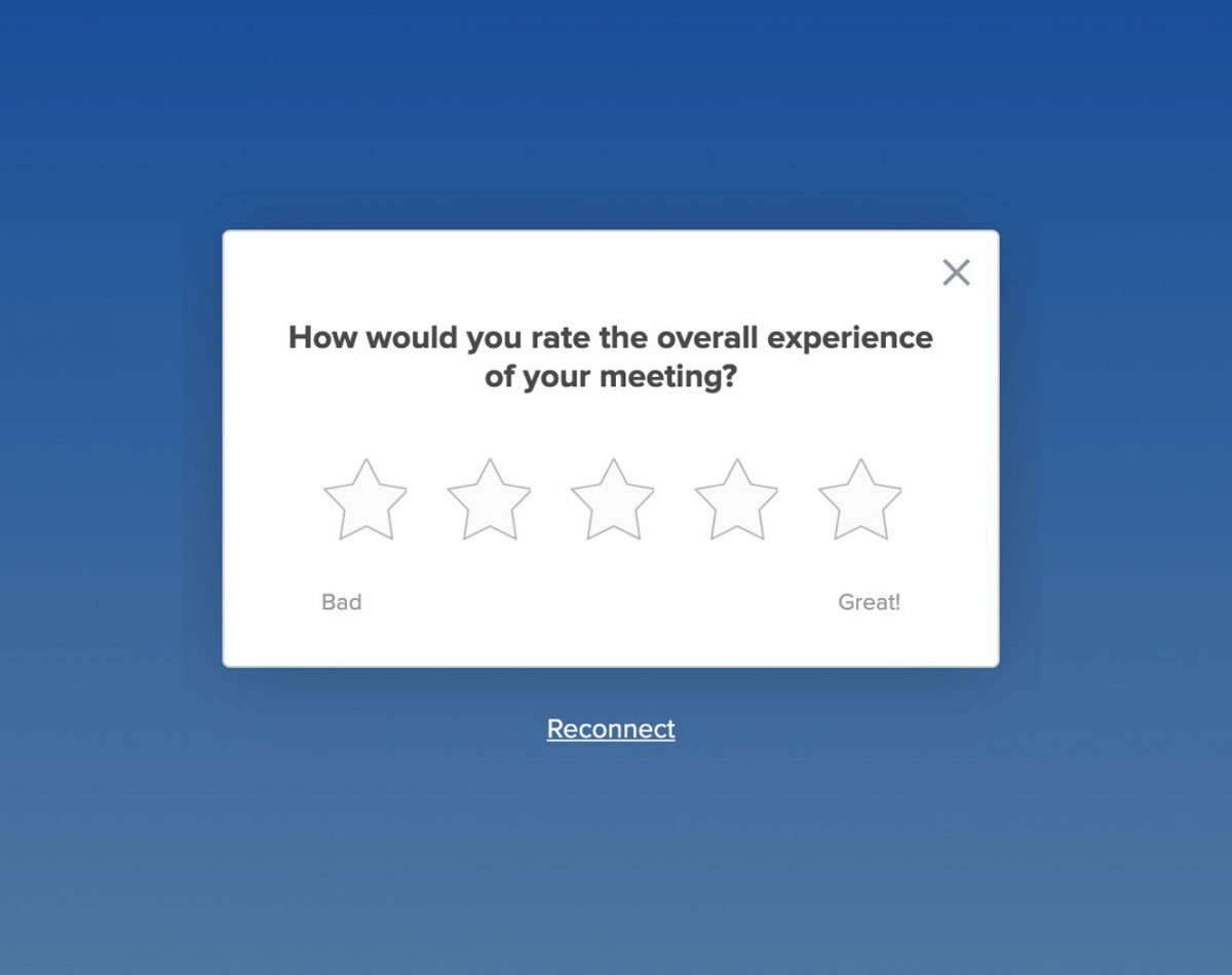
Ask for feedback from users immediately after they’ve completed key tasks, not immediately when they arrive on your site. This way, you increase the chance to receive relevant comments or ratings. Using a modal overlay in this case is less annoying and intrusive to the user.
5. Interrupting users to ask for feedback during critical tasks: Users hate being interrupted, yet examples of websites and applications that disturb users with feedback popups in the middle of completing critical tasks are abundant. Most of the time, giving feedback won’t be the top reason for your users’ visit, so don’t disrupt people with popups in the middle of critical tasks either.
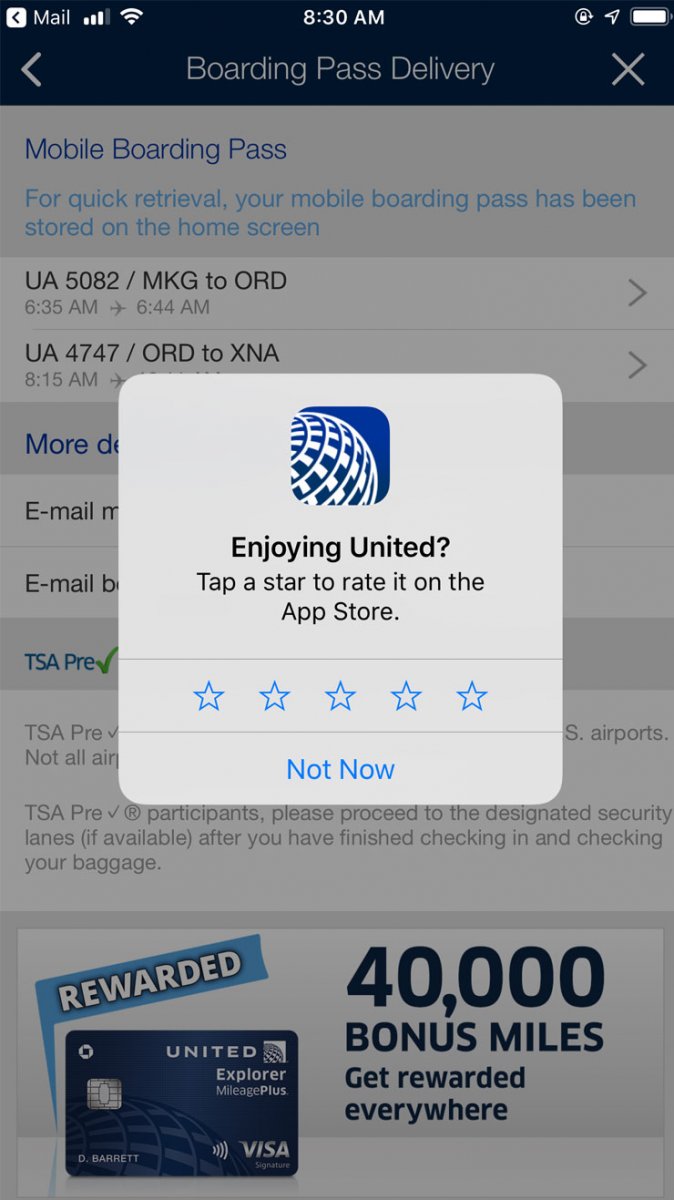
The United app displayed a modal overlay right in the middle of a critical task: retrieving a boarding pass.
What to do instead: In addition to asking users to provide feedback only after critical tasks are completed, offer a static, nonintrusive means by which to give feedback, anytime they want. A tab on the side of the screen, a link in the footer, or a link in the navigation are all acceptable alternatives to disruptive modals and put the user in control of sharing their opinion when they’re ready.
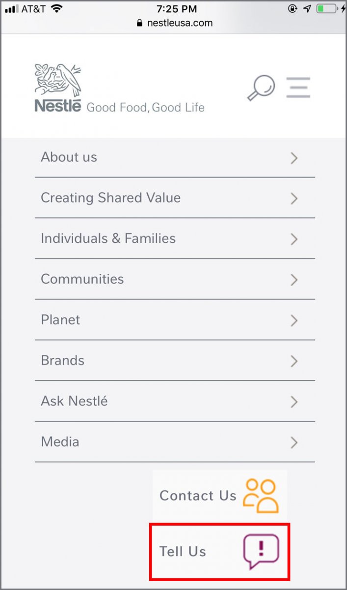
Nestle didn’t interrupt users with a feedback modal, but included a feedback link in the site’s footer.
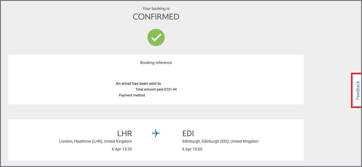
British Airways displayed a button labeled Feedback on the right side of all its pages.
6. Showing multiple popups one after another: Displaying multiple popups on top of each other makes your site look unprofessional, desperate, and disorganized. It also overwhelms users and forces them to spend effort to close each one. If your site uses many different types of popups, test the implementation to avoid presenting users with multiple popups at a time.
What to do instead: If you must present critical information (e.g., important warnings to prevent or correct errors) in a popup, be sure to show only one at a time. Even better, don’t show critical information in a popup, since people tend to close them without reading. Instead, use a visually distinct element and place it directly on the page, where the message best fits contextually. Ensure the copy clearly communicates exactly what the user needs to do to correct the issue and move forward.
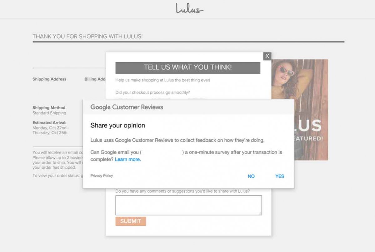
At the end of the checkout flow, Lulus presented multiple feedback modals at the same time. A better approach would have been to show only one at a time or embed the feedback form on the confirmation page.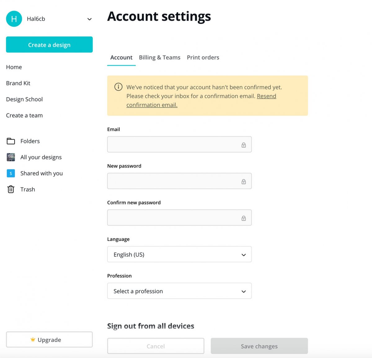
Canva did a nice job of displaying critical information directly on the page. Instead of a popup, it used a visually distinct content module placed at the top. The messaging helped users understand what they needed to do to correct the issue.
Popup Context: Don’t Impede Transitions or Access to Content
7. Displaying a modal overlay before the user moves to a new subdomain or external site: Some corporate websites link to content or applications that live on subdomains and external sites. Before users navigate away from the main site, a modal overlay appears to alert users of the impending transition. This type of popup is problematic because it over emphasizes the transition, making users feel lost and confused — especially if the subsites open in a new browser tab.
During one of our usability-testing sessions, a participant who was looking for a job on HSBC’s website encountered two different transitional modals when attempting a task that was essentially segmented across 3 separate websites. He said, “Wow, it keeps taking me to other websites, I don’t even know where I am anymore. If their job application process is this complex and disjointed, I honestly don’t think it would be a good place to work. It seems like a mess, no matter how nice this site looks.”
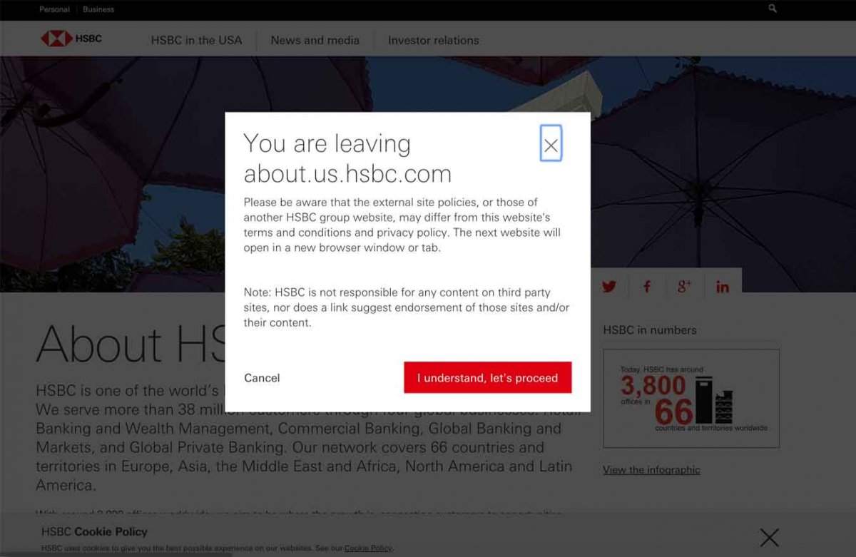
After clicking on Careers, a modal warned users that they were about to leave the initial site.
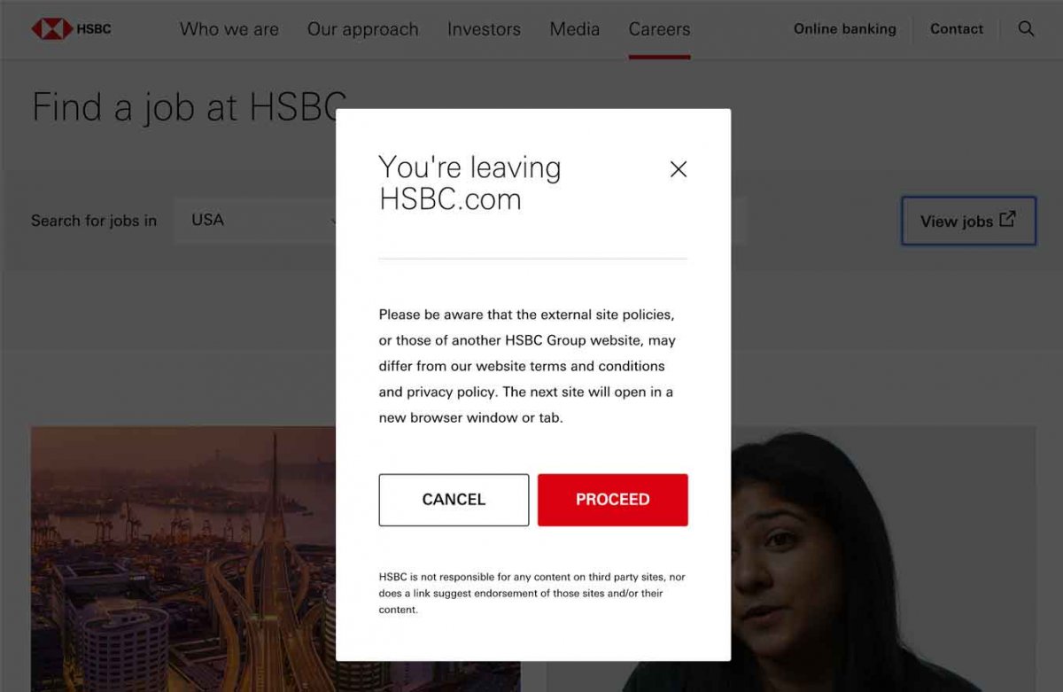
On the same website, users were shown yet another modal stating that they were going to a third website to apply for the job.
What to do instead: Remove the modals, minimize the transitions between sites, and always retain navigation back to the main site when linking users to external properties. If your users do need to be warned when leaving your site, use a less-intrusive option such as a tooltip on the link, to make the transition subtler.
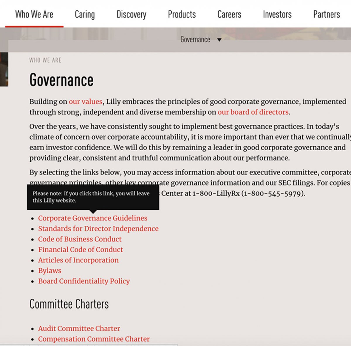
Eli Lilly: Users were presented with an informative tooltip that let them know they were going to a different website. The tooltip helped users to remember where they were and where they were going.
8. Interrupting access to content through modal overlays: A modal dialog that appears immediately after people have loaded an article or other piece of long-form content (such as that usually found in the About Us or News sections of websites) makes it look as if the site is conditioning access to that content. This context is an especially bad place to be annoying because it diminishes credibility and trust. One user on CNN’s mobile application grew frustrated when he encountered a newsletter modal right after landing on an article he wanted to read. He said, “This causes my suspicions of CNN to peak. Don’t ask me for my email or to sign up for anything right away.”
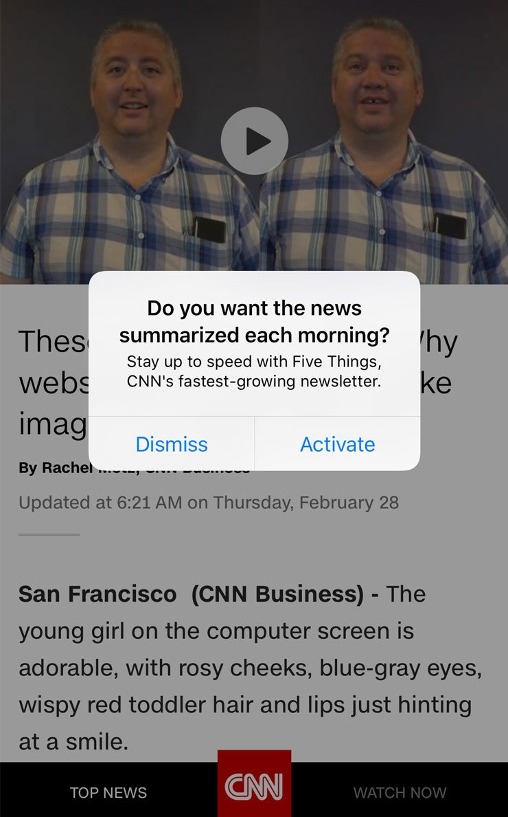
CNN’s mobile app displayed a modal right as the user landed on a page to read an article. This was problematic because signing up for CNN’s newsletter was not why the user was there; reading the content was.
What to do instead: Allow users to consume the content right away, without interruption. Replace the popup with a thin, easy-to-dismiss banner at the top of the page. This alternative to a popup will let the user self-serve if they want to subscribe to a newsletter, without blocking their main task of absorbing information.
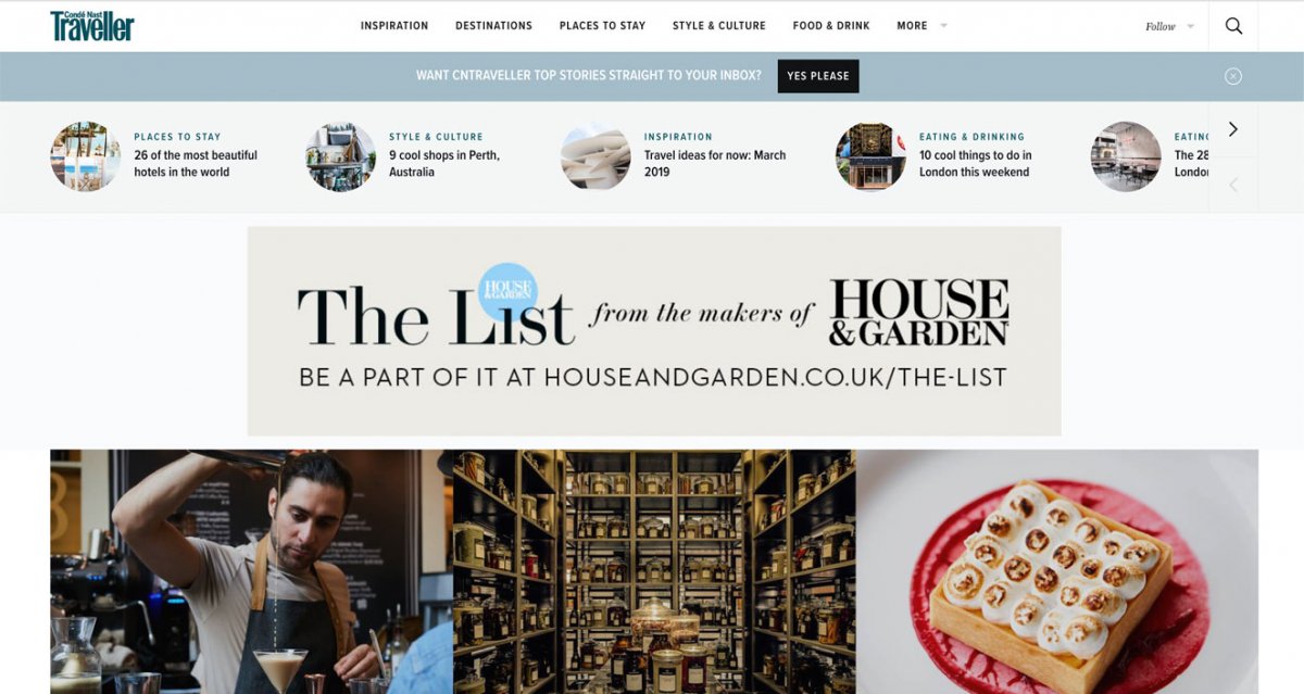
Conde’ Nast Traveller’s website introduced its newsletter in a subtle and nonintrusive dismissible banner underneath the navigation. This design allowed interested users to subscribe to the newsletter, but did not distract those who just wanted to read the site’s content.
Popup Content: Don’t Assume a Modal Overlay Will Deliver the Message
9. Using modal overlays for GDPR and cookie notifications: Users already dismiss modal overlays hastily as they assume nothing good will come of them. For communicating important information related to GDPR and the use of cookies, don’t use modal overlays.
What to do instead: Favor nonmodal overlays placed at the bottom or on the side of the page. These are far less intrusive and allow users to continue with their tasks. Make sure to provide enough information about how users’ personal data is collected and used.

Reddit used a small, unobtrusive nonmodal overlay to ask users for cookie consent; however, language describing how people’s data was used is overly vague.

NNgroup.com used a nonmodal overlay with transparent language about cookie usage. We outlined exactly why we collect people’s data and how it’s specifically used to their benefit.
10. Encouraging channel transitions in modal overlays without communicating a specific benefit: It’s common to see modals that encourage a channel transition from mobile websites to an associated mobile application — especially on ecommerce or news websites. These overlays are disruptive and problematic in many situations: often, web users are one-time users that have no interest in downloading an application for an occasional task.
Understandably, organizations want to encourage application downloads, but a modal overlay is not the right approach for advertising your mobile app. Even users who have your app on their phone may be reluctant to switch channels out of fear of starting their process all over again. A modal overlay will only bother them.
What to do instead: Create awareness for your organization’s mobile application, but not at the cost of intruding on the user’s current task. Favor understated approaches such as a standard top banner and outline the benefits of using the app to ease people’s transition to that channel.
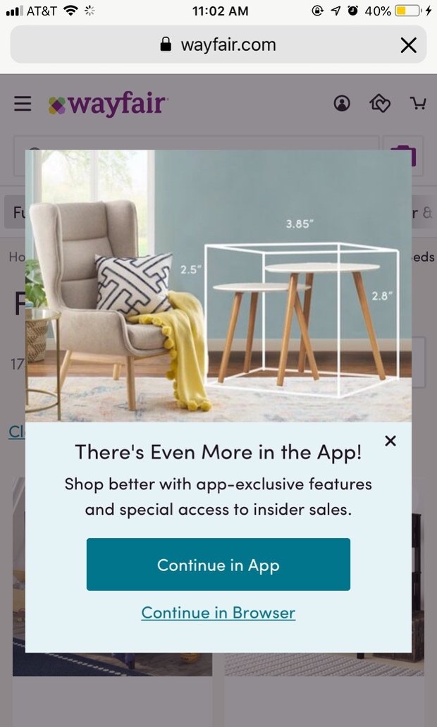
Wayfair interrupted users with a generic modal which encouraged downloads of its mobile app. Users assumed that they would have to put in a lot of work to begin their task all over again on another channel, without a tangible benefit.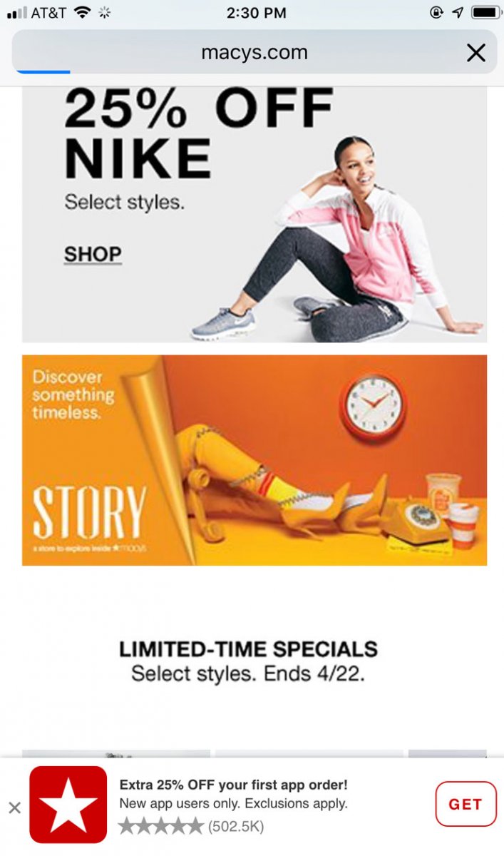
Macy’s did a good job of encouraging mobile app downloads from its mobile website. The nonmodal overlay at the bottom of the page contained an incentive for the channel transition and displayed user ratings for the app.
Conclusion
Pop, pop, it never stops. Not an acceptable user experience, so do stop the pops.
Given this overall conclusion, you may be wondering when it is acceptable to use popups; the answer is: sparingly. Resist the urge to follow the crowd and don’t inundate your users with interruptions to bolster short-term metrics.Explore alternative approaches that respect your users’ needs and preserve your organization’s intent of gathering feedback, notifying users of data collection, acquiring email addresses, or encouraging channel transitions.
Reserve the use of modal overlays for delivering crucial information, only at appropriate times. Don’t interrupt essential tasks or block relevant content with a big, intrusive popup. Conduct usability testing to make sure your popups don’t frustrate your users and, as an added benefit, you’ll get real insights to help you improve your overall experience.
