What makes a font accessible?
What standard fonts are accessible?
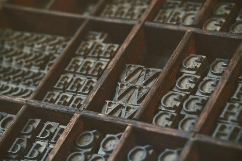
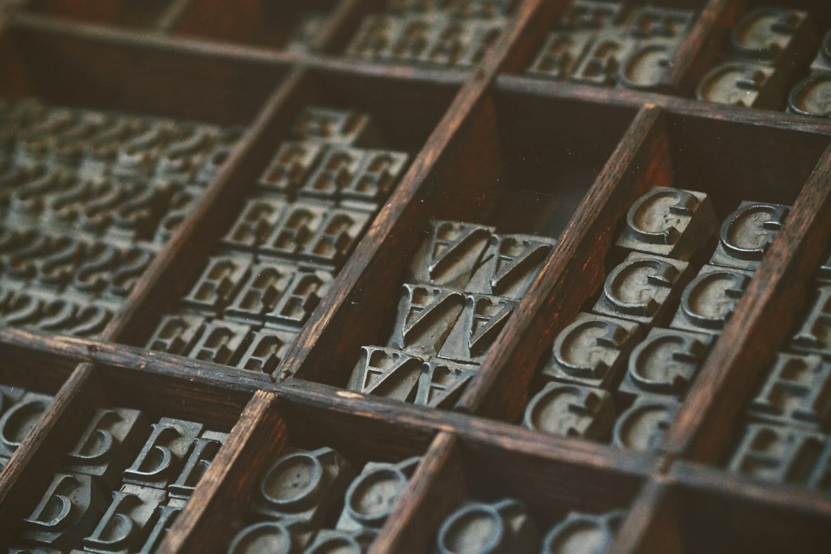
Your choice of font can have a positive or negative impact on the person reading your printed and digital communications. Some fonts are easier to read than others and if chosen well, the right font can really help you get the message across.
What many people don’t know is that some fonts can be inaccessible to disabled people, particularly those with a visual impairment or a learning disability such as dyslexia.
If a font is not designed in a particular way, it might make it difficult for the reader to tell the difference between letter shapes and ultimately make it hard or impossible to understand what is written.
Did you know?
- 1 in 30 people in the UK is blind or visually impaired
- Around 15% of the population has dyslexia
- 1.5 million people in the UK have a learning disability
- 35% of adults don’t read for pleasure. (Taking Part 2011/12 Adult and Child Report, Department for Culture Media and Sport, 2012)
What makes a font inaccessible?
Fonts that are very elaborate or ornate can be difficult to read or see clearly as the letter shapes are not well defined or regular in shape and size. The same applies to handwriting style fonts, which are very popular in a lot of communications.
Which standard fonts are accessible?
- Arial
- Calibri
- Century Gothic
- Helvetica
- Tahoma
- Verdana
All these fonts are “sans serif” fonts. A serif is a little decorative line that is found on letters in some fonts like Times New Roman or Georgia.
“Sans serif” means “without the decorative line”. Some people find it difficult to read serif fonts, because they distract the eyes and the brain from the overall shape of the letter.
The use of serif fonts in digital publications can be problematic as the pixilation on screen can distort the serif, causing the word to blur around the edges.
Slab serif fonts such as Arvo, Museo Slab and Rockwell are also considered to be accessible. Such font types are mostly used in headings rather than the main body of text.
Choosing an Accessible Font For Dyslexia
Dyslexia is a very varied condition so the difficulties can be different from person to person. Typically people with dyslexia experience some of the following when reading:
- Letters or words moving or spinning on the page
- Confusion around spacing between letters and individual letters such as confusing the letter ‘m’ with the letters ‘r & n’ when written together as in: modern and modem
- Mixing up letters with their mirror images such as ‘b’ and ‘d’, ‘p’ and ‘q’
There are a few different specialist fonts available that have been designed particularly for people with dyslexia. The two most commonly used are:
- Dyslexie
- OpenDyslexic
What makes those fonts easier to read for people with dyslexia is the shape of the letters. Both Dyslexie and OpenDyslexic weight the bottom of the letter shapes, which helps the letters from appearing to move around and helps the reader to tell the difference between mirror letters like ‘b’ and ‘d’.
Dyslexie and OpenDyslexic are free to download, but Dyslexie is available for personal use only.
Choosing an Accessible Font For Learning disabilities
There is a specialist font for people with learning disabilities called ‘Fs Me’. This font helps with the legibility of letters, for example the dots over ‘i’s and ‘j’s are larger and easier to see and the tail on a comma is longer than most other fonts.
Fs Me was commissioned and is endorsed by the UK’s leading learning disability charity Mencap. ‘Fs Me’, a specialist font for people with learning disabilities.
Tips on fonts and web accessibility
Your font choice might be set by your brand guidelines, but there are some things you can do to make your digital communications as accessible as possible:
- Use a small number of fonts, ideally only 1 or 2 for headings and body text. • Make sure there is good colour contrast between the text and the background.
- A recommended minimum font size is 12 pt.
- Don’t animate text and avoid making the letters flash or blink.