The basic idea behind the internet - when Tim Berners Lee invented HTML in 1989 - was to connect documents. We use hyperlinks to jump from one document to another. We've already talked about the importance of a well-written link as well as proper contrast. Now let's have a look at the overall appearance.
Looking around on the internet you'll notice that most modern pages mix up links and buttons. The question is why? CSS frameworks give you the opportunity to style your links like buttons.
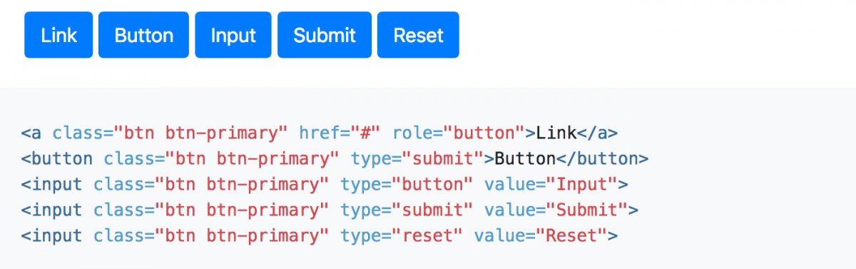
The famous Bootstrap's got a CSS class selector called btn. You can apply this selector to a button and to a link. It will make both look alike - although they are different control elements.
You can see that in every framework you can apply something like .buttonoder .btn and your link is disguised as a button. Maybe that's not so bad, but a link and a button are completely different things. They behave differently. So why should they look the same?
Simple set of rules
A link is focusable and can be triggered by the enter key. A link will redirect you to a new page or a section within the same page. In VoiceOver's rotator, it will also be collected within the "Links" window.
A button is focusable, too, and can be triggered by the space key. A button will trigger an action like opening or closing something. Or sending a form. In most cases JavaScript is used to do this. In VoiceOver's rotator, it will be collected within the "Form controls" window. That alone says something.
What's the problem?
Expectations. It's not necessarily about sightless people. On the contrary. Let's think about people visiting your page who use their keyboard to navigate through your content. They see a "button" and expect something to happen. They are looking for an action to happen - like sending a form, opening a layer, closing a layer or opening a menu. Suddenly they get redirected to a new page. Okay, they probably won't open a page in the first place because they are using the space key. But nothing happens. Don't frustrate your users.
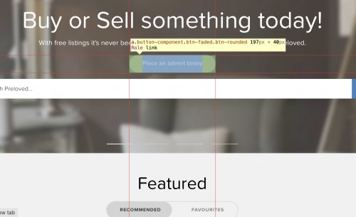
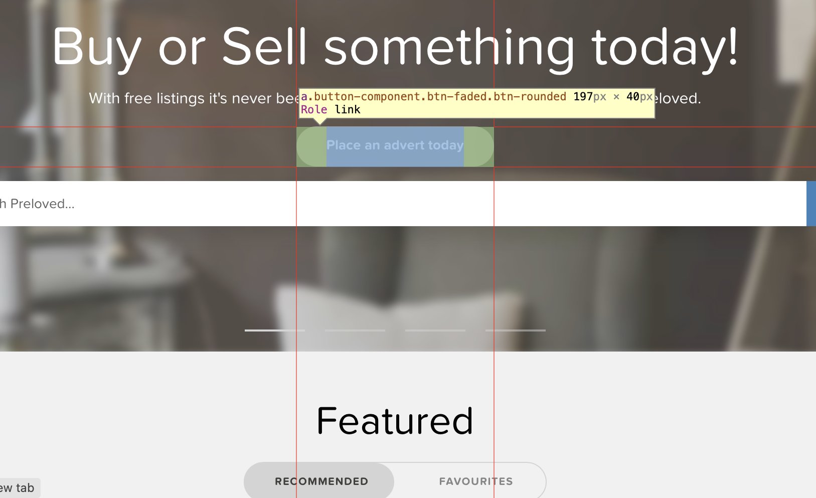
And please, can somebody explain to me why on earth someone should do something like this: <a class="button is-text">Text</a> There is a perfectly good link. We all love them. They are the "juice" of the internet. But someone put a .button on it only to add a .is-text on top so the link will change from being an underlined text to a button, back to looking like an underlined link. What's going on?!
Conclusion
Don't confuse your users. A link should look like a link and not like some other element, in this case like a button. Links and buttons may "feel" the same for average users. They will use their mouse to hover over the link or the button and click on them with their mouse. But when using the keyboard and camouflaging a link as a button, things are bound to end in tears (well, they’re not going to work out as planned, that’s for sure.
I get the idea. You want to sell something. You need something that screams "Click me!" That's okay when clicking on a button. I expect an immediate action. I don't want to be redirected to a new page. Maybe even a marketing page with lots of copy on it. That is the opposite of "Buy me now!"
As a designer you should try and think of a different way to get the user's attention. As a developer you should always think about the purpose of an element and then use the correct HTML to achieve that.